Climate Data Analysis
Climate change and temperature anomalies
If we wanted to study climate change, we can find data on the Combined Land-Surface Air and Sea-Surface Water Temperature Anomalies in the Northern Hemisphere at NASA’s Goddard Institute for Space Studies. The tabular data of temperature anomalies can be found here.
The period between 1951 - 1980 is our reference in defining temperature anomalies.
Loading the data set
weather <-
  read_csv("https://data.giss.nasa.gov/gistemp/tabledata_v4/NH.Ts+dSST.csv",
           skip = 1,  #real data table only starts in Row 2, so we need to skip one row.
           na = "***")
##
## ── Column specification ────────────────────────────────────────────────────────
## cols(
## Year = col_double(),
## Jan = col_double(),
## Feb = col_double(),
## Mar = col_double(),
## Apr = col_double(),
## May = col_double(),
## Jun = col_double(),
## Jul = col_double(),
## Aug = col_double(),
## Sep = col_double(),
## Oct = col_double(),
## Nov = col_double(),
## Dec = col_double(),
## `J-D` = col_double(),
## `D-N` = col_double(),
## DJF = col_double(),
## MAM = col_double(),
## JJA = col_double(),
## SON = col_double()
## )For each month and year, the data frame shows the deviation of temperature from the normal (expected).
Isolating the columns we need and tidy data
tidyweather <- weather %>%
  select(c("Year", "Jan", "Feb", "Mar", "Apr", "May", "Jun", "Jul", "Aug", "Sep", "Oct", "Nov", "Dec")) %>%
  pivot_longer(cols=c('Jan', 'Feb', 'Mar', 'Apr', 'May', 'Jun', 'Jul', 'Aug', 'Sep', 'Oct', 'Nov', 'Dec'),
               names_to = "Month", values_to = "Delta")
Plotting information
tidyweather <- tidyweather %>%
  mutate(date = ymd(paste(as.character(Year), Month, "1")),
         Month = month(date, label=TRUE),
         Year = year(date))
ggplot(tidyweather, aes(x=date, y=Delta))+
geom_point(size = 0.5)+
geom_smooth(color="red") +
theme_bw() +
labs (
title = "Weather Anomalies",
subtitle = "Temperature progression over time",
x = "Year",
y = "Delta in T (°C)"
)+
# scale_x_date(date_breaks = seq(min(tidyweather$date), max(tidyweather$date), by = 8300))
scale_x_date(date_labels = "%Y", date_breaks = "10 years")## `geom_smooth()` using method = 'gam' and formula 'y ~ s(x, bs = "cs")'## Warning: Removed 4 rows containing non-finite values (stat_smooth).## Warning: Removed 4 rows containing missing values (geom_point).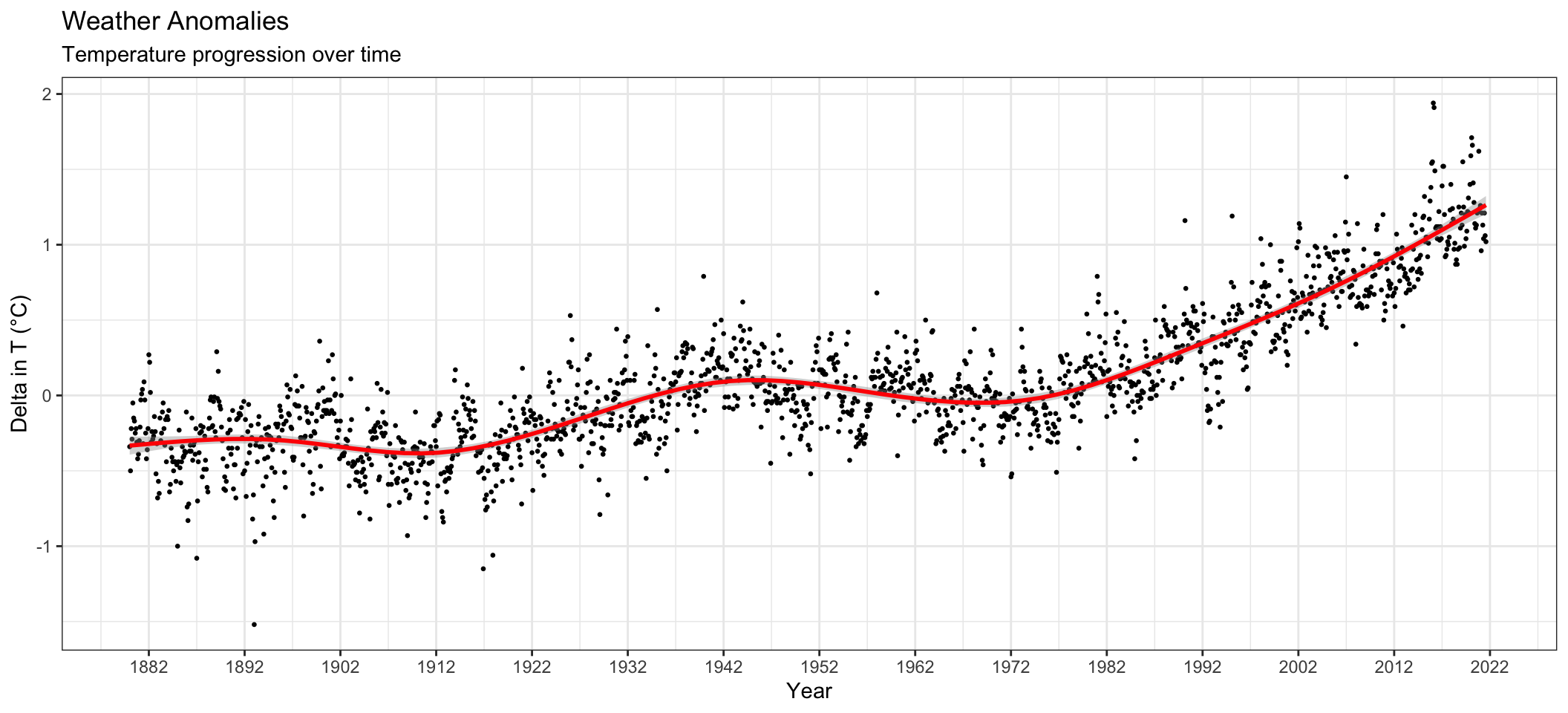
Scatter plot for each month:
tidyweather$Month <- factor(tidyweather$Month,
                            levels = c("Jan", "Feb", "Mar", "Apr", "May", "Jun", "Jul", "Aug", "Sep", "Oct", "Nov", "Dec")) #so that the facet wrap shows according to months

ggplot(tidyweather, aes(x=date, y=Delta))+
  geom_point(size = 0.3)+
  geom_smooth(color="red") +
  theme_bw() +
  facet_wrap(vars(Month)) +
  labs (
     title = "Weather Anomalies broken down by months",
    subtitle = "Temperature progression over time",
    x = "Year",
    y = "Delta in T (°C)"
  )
## `geom_smooth()` using method = 'loess' and formula 'y ~ x'## Warning: Removed 4 rows containing non-finite values (stat_smooth).## Warning: Removed 4 rows containing missing values (geom_point).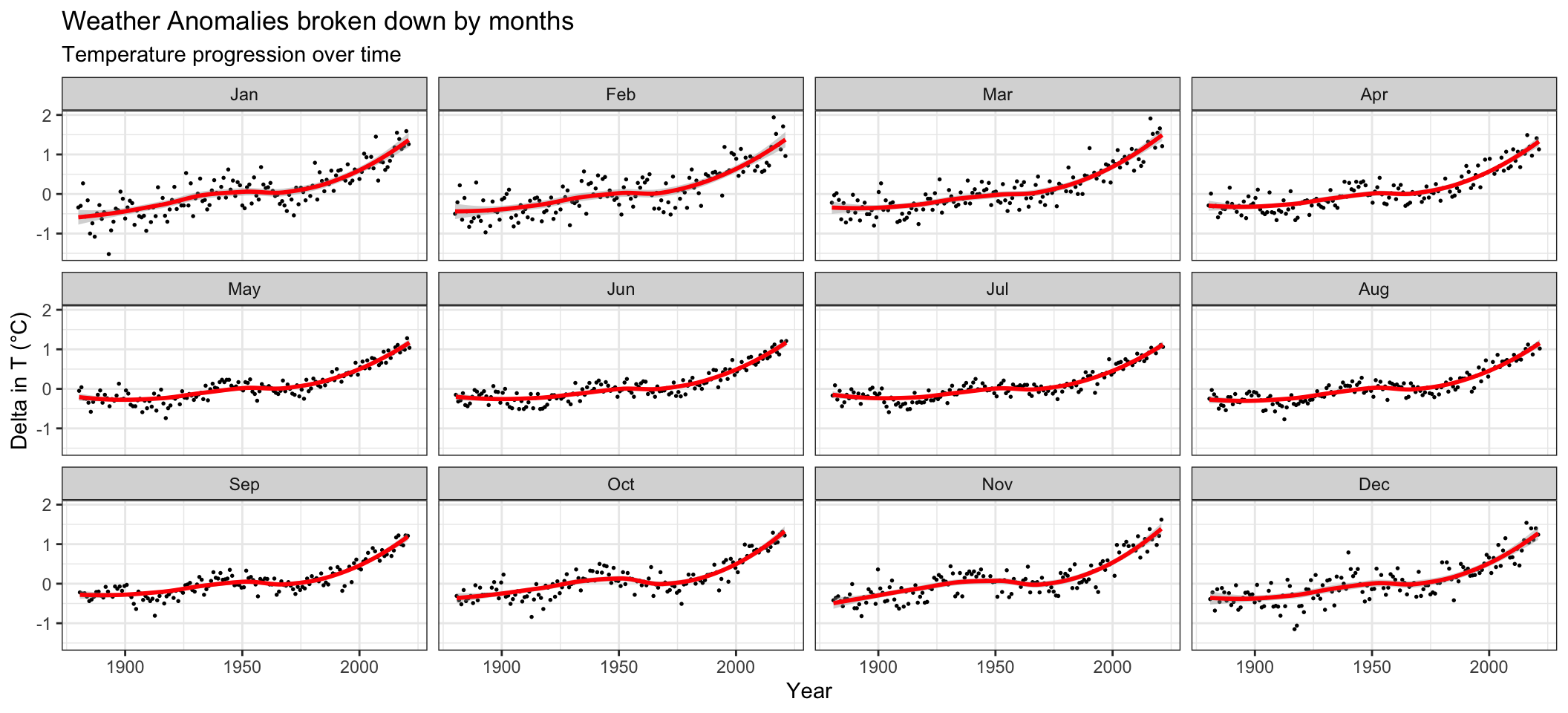
Based on our analysis, the effect of increasing temperature seems to be constant throughout the year. A more obvious indicator would be the Year instead - the effect of increasing temperature is more pronounced after the period between 1951-1980 as we can see a steep increase in the graph.
Grouping the data into time periods
comparison <- tidyweather %>%
  filter(Year>= 1881) %>%     #remove years prior to 1881
  #create new variable 'interval', and assign values based on criteria below:
  mutate(Interval = case_when(
    Year %in% c(1881:1920) ~ "1881-1920",
    Year %in% c(1921:1950) ~ "1921-1950",
    Year %in% c(1951:1980) ~ "1951-1980",
    Year %in% c(1981:2010) ~ "1981-2010",
    TRUE ~ "2011-present"
  ))
Distribution of monthly deviations
ggplot(comparison, aes(x=Delta, fill=Interval))+
  geom_density(alpha=0.2) +   #density plot with transparency set to 20%
  theme_bw() +                #theme
  labs (
    title = "Density Plot for Monthly Temperature Anomalies",
    y     = "Density",         #changing y-axis label to sentence case
    x = "Delta in T (°C)"
  )
## Warning: Removed 4 rows containing non-finite values (stat_density).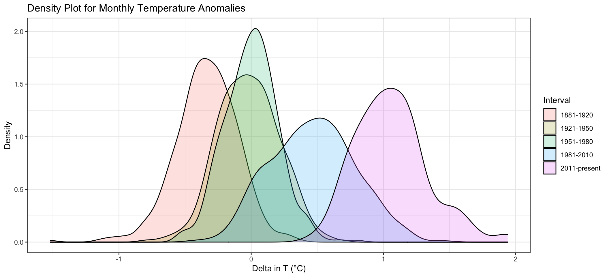
Average annual anomalies
#creating yearly averages
average_annual_anomaly <- tidyweather %>%
  group_by(Year) %>%
  summarise(annual_average_delta = mean(Delta, na.rm=TRUE))

#plotting the data:
ggplot(average_annual_anomaly, aes(x=Year, y= annual_average_delta))+
  geom_point(size = 0.8)+
  geom_smooth(colour = "red") +
  theme_bw() +
labs (
     title = "Average Yearly Temperature Anomaly",
    subtitle = "Temperature progression over time",
    x = "Year",
    y = "Delta in T (°C)"
  )+
  scale_x_continuous(n.breaks = 20)
## `geom_smooth()` using method = 'loess' and formula 'y ~ x'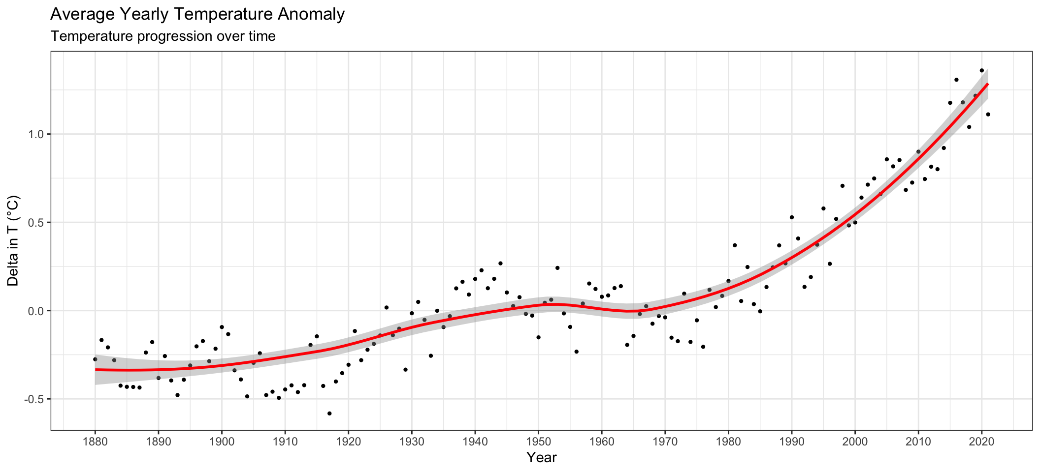
Confidence Interval for delta
NASA points out on their website that
A one-degree global change is significant because it takes a vast amount of heat to warm all the oceans, atmosphere, and land by that much. In the past, a one- to two-degree drop was all it took to plunge the Earth into the Little Ice Age.
Confidence Interval for delta (Formula)
formula_CI <- comparison %>%
  filter(Interval == "2011-present") %>%
  summarize(median_delta = median(Delta, na.rm=TRUE),
            mean_delta = mean(Delta, na.rm=TRUE),
            sd_delta = sd(Delta, na.rm=TRUE),
            count = n(),
            t_critical = qt(0.975, count -1),
            se_delta = sd_delta/sqrt(count),
            margin_of_error = t_critical * se_delta,
            lower_CI_delta = mean_delta - margin_of_error,
            upper_CI_delta = mean_delta + margin_of_error
  )

#print out formula_CI
formula_CI
## # A tibble: 1 x 9
## median_delta mean_delta sd_delta count t_critical se_delta margin_of_error
## <dbl> <dbl> <dbl> <int> <dbl> <dbl> <dbl>
## 1 1.04 1.06 0.274 132 1.98 0.0239 0.0473
## # … with 2 more variables: lower_CI_delta <dbl>, upper_CI_delta <dbl>Confidence Interval for delta (Bootstrapping)
library(infer)

set.seed(1234)

boot_delta <- comparison %>%
  filter(Interval == "2011-present") %>%
  specify(response = Delta) %>%
  generate(reps = 1000, type = "bootstrap") %>%
  calculate(stat="mean")
## Warning: Removed 4 rows containing missing values.percentile_ci <- boot_delta %>%
get_ci(level = 0.95, type = "percentile")
#print out bootstrap_CI
percentile_ci## # A tibble: 1 x 2
## lower_ci upper_ci
## <dbl> <dbl>
## 1 1.02 1.11Comparison of Confidence Intervals
visualize(boot_delta) +
  shade_ci(endpoints = percentile_ci) +
  geom_vline(xintercept = formula_CI$lower_CI_delta, linetype = "dashed", colour = "red", size = 1) +
  geom_vline(xintercept = formula_CI$upper_CI_delta,linetype = "dashed", colour = "red", size = 1) +
  theme_bw() +
  labs(
    title = "Bootstrap CI for Average Annual Delta since 2011",
    subtitle = "Fomula CI shown with dashed red lines",
    x = "Delta T (°C)",
    y = "Count"

  )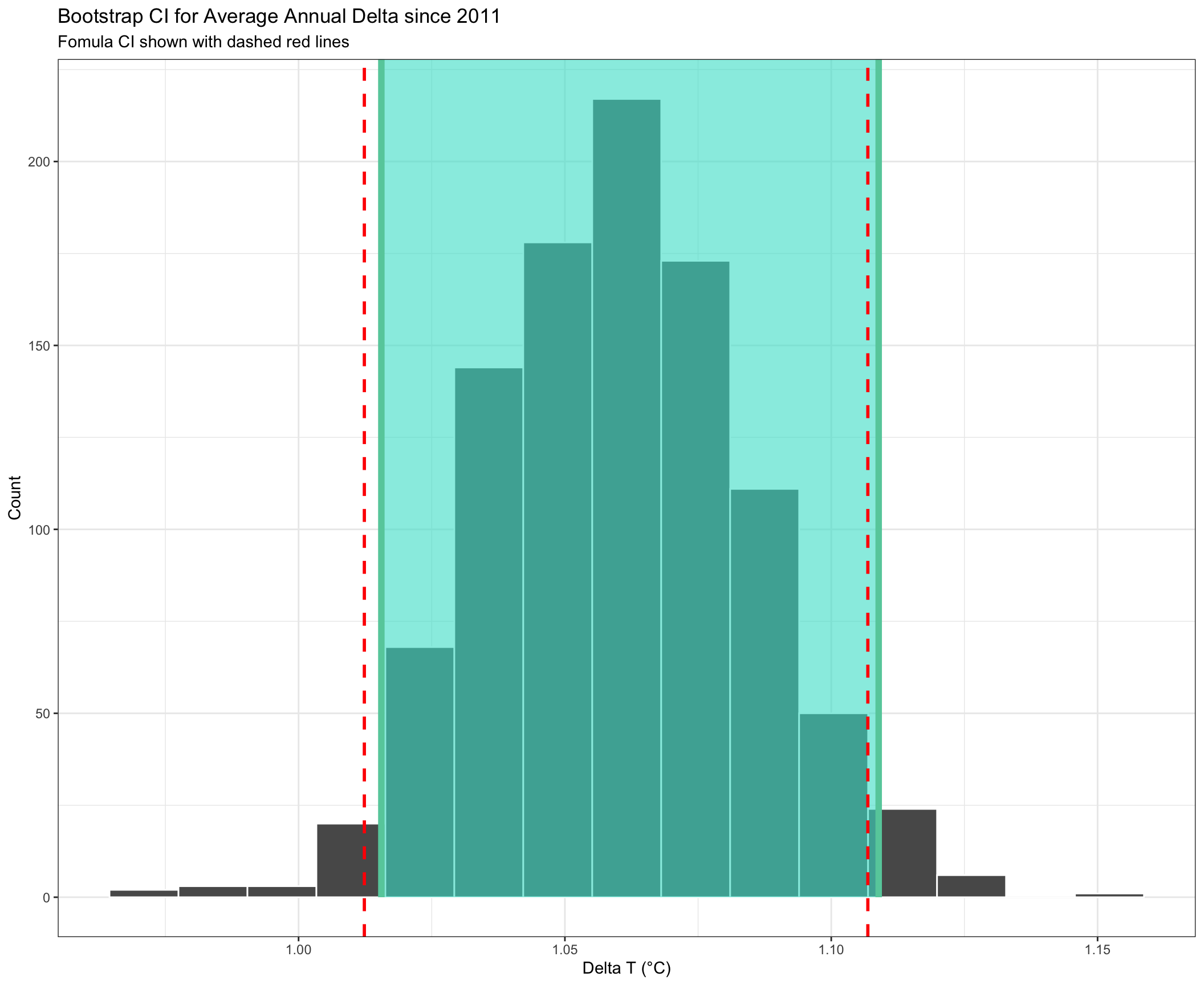
Based on our analysis, the 95% confidence interval (CI) for the average annual delta since 2011 was calculated as (1.01, 1.11). This means that we can be 95% confident that the average annual delta falls within 1.01 and 1.11. We constructed the CI using the formula method and using a bootstrap simulation, both method gives us a very similar width - the shaded area is the CI calculated using a bootstrap simulation and the range between the dotted lines is the CI calculated using the formula.